Showing posts with label Layouts. Show all posts

Thursday, June 12, 2014

New Layout & Cat Rescue Story

We LOVE our critters & are proud that all of them are rescued.  Each of our furry crew is totally a family member with a unique personality & gives us so much love.  I've been capturing the memories of how they came to be in our family on scrapbook pages.  

Do I have a photo from the day we got them?
Maybe not but does that stop me?
No Way

I think we get too hung up as scrapbookers thinking we don't have a photo for a story we want to tell or even worse that it's not a good photo.  I have to tell you that some of my favorite pages have horrible photos from the 80's (you know that distinct color that those photos have... I mean seriously heritage photos from the 60's or even the 40's look better than whatever the industry was doing when processing back in late 80's when my boys were babes).  I think we are in an age of a lot of really poor quality photos due to the use of the phone more often than the dslr or better point & shoot camera.  I encourage you to just do it - use those photos because it's the memory & story that's important.

So let me introduce you to Miles.  
We think he's a Norwegian Forrest or Main Coon mix of some sort but a very pretty cat.  
Gorgeous green eyes that always look good in photos 
(unlike our ragdoll Pom who looks great in person but rarely in photos).

He's our only kitty with a collar, tag & most importantly a bell
 (though they are all micro chipped)
because he lives to get out of the house if you're dilly dallying letting dogs in or out he's gone & I'm running out there like a loon screaming "M-I-L-E-S!!!!!!!" then corner & grab him 
(sometimes with police deputy dog Rosie)

He's always with me if I am in the scrap room creating.
Usually just hanging out in the window looking at all the birds & squirrels on the feeder...
but sometimes knocking things off the table as he stretches to lay down & they're in his way

He has a snaggle tooth that's always hanging out & makes me smile.
A big "talker" if you say "meow meow" he can't resist answering you back
with same rhythm and inflection... a real mimic.
So of course his nick name is "Miles of Smiles" because that's what he gives us
& where the title of the page comes from

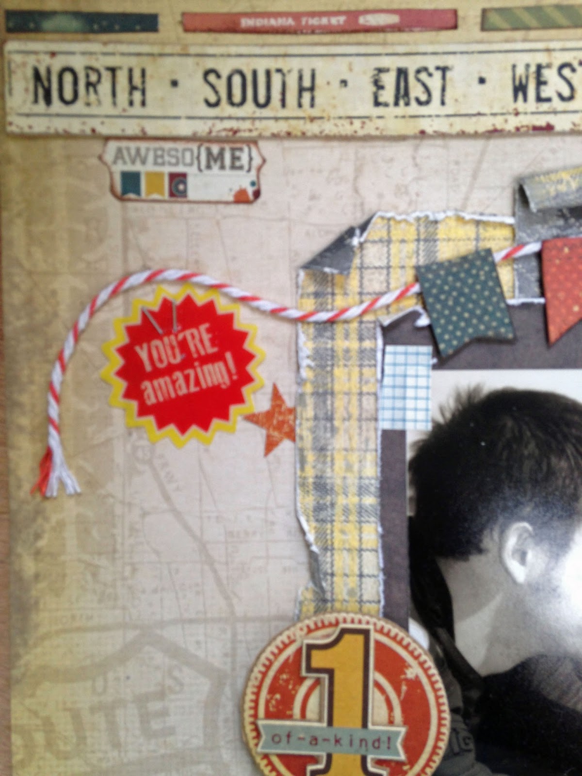
Here's the layout I made mostly using Teresa Collins Family Stories
 that I purchased at my LSS  EMI Scrapbooking

This page was started at a crop so I was limited to products I had in a page kit bag.
That's always a struggle for me & the hot mess will come together at the end when I'm at home. 
Rarely do I finish a page at a crop.  
I'm a drag out a bunch of stuff & mix it up kind of creator so home is better for me.
So let me share some of my thought process when creating this page

 After I made the layers of paper under the photo 
I always focus on the titlework.
I like to mix fonts & make it interesting.

The black letters are a Tim Holtz die & scraps of inexpensive card stock
glued to a journaling card cut from the patterned paper. 
It didn't seem like enough so I added the Studio Calico wood letters & images 
that along with the embellishment clusters seemed to balance the title against the photo area 
& I love any reason to use wood embellishments lol

The cute banner was a die cut from the 12x12 collection sheet.
I punched the star from orange dots the negative space adds interest & then used the die cut on the blue pennant to draw the eye across.  Stapling the twine let it fall randomly.

I went heavy at the top right with a variety of paper scraps, diecuts  & dimensional embellishments.

I'm a big fan of sequins since they are subtle & very inexpensive way to add interest
& draw the eye around your page.  
I adore the enamel dots but they're really costly to add more than a few to each project 
so sequins gives similar effect without the $$$

I used the twine to anchor the photo & draw the eye.
Using it 3 places created a visual triangle to encourage you to look at photo first.
I'm all about the little details... 
I added a brad to the cardstock tag & a wood heart in center of the image.
Always look for ways to layer or add to a store bought embellishment.

Finally I love to finish with some dots of spray ink.  It's transparant & 
adds that "somethingsomething" that makes me say it's done & I like it

Even thought there is journaling on the front of the layout with enough room for basic story.
in the area under the arrow border strip I had so much more to tell about
how Miles came to be a "Gray" that the family in the future.
I started writing on a sheet of kraft cardstock.  Cut it down & adhered to the back
I usually date it when I actually journal (even if years later from the actual memory)

I had been shopping for food & litter at Pet Supermarket near our house.  I never shop on weekends at pet stores because I know the rescues are there so I was surprised that there were kitties in cages trying to get my attention in the middle of the week.  I should know better than to stop & visit with the rescue animals available.  Miles caught my eye because Andrew has always wanted a Norwegian Forest cat.  He had so much personality & I couldn't get him out of my mind.  At home I told everyone about him & the next evening we went to eat mexican across the street & talked everyone into going to see Miles.  He was named by the Mountain Park Library because that's where he was living for a couple days & they finally caught him in the CD jazz music section.... so he was dubbed  "Miles Davis".  We all fell in love with Miles & my aunt was visiting from Pittsburgh PA fell in love with the most stressed out sour female kitty - she wanted to get her & take her home on the plane in a couple days.  The rescue lady who worked as a cashier in the store said she would throw Dakota in for free (guess no one interested in her since her personality wasn't shining AT ALL - she had been in a bedroom with an elderly lady hanging out & but not being very well cared for due to the ladies physical ailments).  Of course we leave with both kitties.  Auntie didn't end up taking Dakota home with her on the plane it was a "later" thing that I knew she would never get her.  She even look like the same cat - she was so stressed that her face looked different.


It took Koda a while to settle in & doesn't really like the "guys" because she likes her space & they don't know boundaries.  But she's as sweetheart & in our family thanks to Auntie & Miles.

Supplies:  Paper, Sequins, Stickers, Wood Chip, Cardstock Diecut Sheet, Post Notes, Buttons, Brads, Border Strips (Teresa Collins Designs); Wood Embellishments, Sequins, Spray Ink (Studio Calico); Letter Die (Tim Holtz); Brads & Twine (Maya Road); Stamps (Heidi Swapp); Punch (Fiskars), Pen (American Crafts), Ink (Tsukineko Versafine black)


Thanks for stopping by...

Tuesday, March 18, 2014

Perfectly Happy


We love our animals - they really bring us so much joy in everyday life...

We've always been "dog people" but now cat & dog people.  We rescued Koda - she very affectionate to people but has always been shy & easily upset by some of the other cats.  She's happy hanging out in our bedroom & "allowing" Miles & Pom to come visit her during the day.  She definitely has a royal attitude about her.  She entered the rescue organization after her owner passed away - she lived in a bedroom with an elderly woman.  At first I kept trying to change her keeping bedroom door closed in day & making her stay out in the house.  It really stressed her out since she wanted to be the top cat in the hierarchy but the guys had other ideas.  I consulted our vet & read a bunch online & realized I should stop trying to change her... if she's happy then why not just let her be where she wants to be.  The Queen of my Bedroom is Koda.

I love the Stationary Noted line from Teresa Collins.  EMI Scrapbooking if you are local to Atlanta has some still in stock.

Don't you love the beautiful soft colors with pop of read, lots of graph or lined papers.  It's classic, versatile & gender neutral.  I "girled" it up on this page using almost all the floral papers in the collection but Koda is a girly-girl so it suited her.


I like to cluster the embellishments to draw the eye around the page & add interest.
Lots of journaling cards to choose from on a single piece of patterned paper are my favorite inexpensive thing to stock up on.  I always buy extra if it's a neutral color that can go on other projects.

Lots of enamel dots scattered around the page (LOVE THEM SO MUCH)

I like a mixed font title.  Tie bits of twine on the chipboard letters to add just a little special detail.
The words border under to anchor it is the throw away after cut off piece of the paper - I always save them... another budget friendly bonus from a piece of paper.


The brads for this line are gorgeous - layered on a punched circle then popped up for dimension
I used a lot of the die cut borders each of them layered just perfectly together.


Teresa designs from a user standpoint & that is why her collections are so easy to create with.

Hope you have some time to do something creative today

Monday, February 25, 2013

Starting off the week with yet another layout.....

I'm on a roll with creating layouts.

I'm a longtime reader of Stephanie Howell's blog.  She shares her life as an army wife & mom to 4 beautiful daughters.  I enjoy reading about the latest escapades of the "chicks" - that Sadie slays me with just a look.  It brings back memories of having little ones in the house & life at that stage.  She's honest with the good & bad in each day while remembering to be thankful in all things.  My heart aches for her when her hubby is deployed in some of the most dangerous places in the world.  She is an amazing strong woman.  Recently she posted that she was doing her first class at Big Picture Classes called Ties That Bind.  It's all about capturing the relationships we have in our lives.  It is a self paced class & you have access to it for 2 years.  If you want more information click here.

The class gave me lots of visual inspiration but more importantly it gave me inspiration to dig deeper into capturing memories & sharing with my family my feelings about them.  Not a superficial who, what, where, when style page.  You had to figure something got me excited about layouts again when this is the 3rd post in a row.  The journaling is more personal (I'm glad I hadn't journaled on the pages I started at the crop).

This page is about my Grami.  I recently received a bunch of old family photos since my Aunt moved in with us.  I adore this photo.  It is a visual of what my grandma tried to teach me all the time since I hated to have my picture taken.  She'd say it's not about how you look that will make it a good picture of you it's how you feel about yourself.... relax & be confident.  This picture shows her doing just that.  She was beautiful inside & out.  I miss her every day.  I was so close to her & feel like everything I like about myself I got from her.  I was even named after her... she's Sue.

One of the best things about living where my grandparents raised their kids was being right across the bridge from an amazing family run historical amusement park that is still going strong today.  They were able to go to Kennywood Park many times during the season.  School & church picnics, an entire Saturday, or a few hours an evening after work.  Every year each family member got their picture taken under the yearly sign.

I like the easy breezy feel of American Crafts Dear Lizzy 5th & Frolic (3 different papers front & back - I love how American Crafts does a different pattern on the back of the marketing strip so that gave me 3 more prints).  It's funky & fresh.  It mixed well with some older supplies I had on hand in my stash.

Sorry for the poor quality photo....
I've been lazy & using the iphone instead of bringing out the "big camera" dslr

Inside the pocket gave me plenty of room for journaling. 
I added a My Mind's Eye brad just because :)

The more superficial  who what where when journaling was in the pocket
at the bottom I shared a personal memory of Grami that she taught me.
 The wooden arrow from Pink Paislee reminded me of the arrow in the
Kennywood logo that you will see all over town to point the way to the park.

I made this little pocket by folding up the double sided paper & closing
the sides with Teresa Collins Tell Your Story washi tape.
Making Memories Tiny Types - even though everyone does them now these are still my favorites.
-- take note people don't do shiny stickers --
American Crafts flare is like a button that we wore on our denim jackets.

2 different size doilies from Little Yellow Bicycle & a 
festive pin with a pennant from House of 3 Pink Paislee
cute chipboard embellishments from October Afternoon Sidewalks collection.
of course everything is better with a bit of twine & some machine stitching

Thanks again Stephanie for inspiring me.
Hope you have a fabulous Monday & remember to do something creative

Friday, February 22, 2013

Best Friends Layout

I have been blessed with a long time best friend.  Lori & I met in 4th grade when she moved to my school.  We became fast friends.  It's amazing as we are both turning 50 this year that we are still best friends.  It's wonderful to have someone in my life that I can totally be myself with & never fear judgement... she just "gets me".  We talk often on the phone that the physical miles vanish & it's like we're in one of our kitchens just catching up & chatting the hours away.

We moved to Georgia in 1979 when I was 16.  It was so hard for me to have left Lori behind.  At that time the cost of a long distance call was $ 0.25 a minute!  My dad wasn't happy with the phone bill each month.  When we lived in same town we would immediately get on the phone after being together all day at school and talk for hours on the kitchen phone with the 25 foot long cord.  We'd both stretch the cords down the basement steps with the door closed for privacy - those coiled cords would be all wonky from being overstretched & drove our moms crazy.  Our phone was that 70's yellow.


I love Teresa Collins products!  They are so well designed & the style is timeless.  When I see pages in my album that I made years ago they don't feel "dated" because it's too trendy & detracts from the photos/story.

I'm such a blue jeans gal - easy breezy for me.  I LOVE navy blue & yellow in this line and several pages have text.  It just feels fresh & has such clean lines.

My parents let me go back to Baltimore for Easter because I was so depressed after moving the summer before.  I missed Lori & my grandparents who lived in Pittsburgh PA.  They would come to see us all the time growing up since it was only a 4-1/2 hour drive.  Now the only time we would see them is when they flew down a couple times a year (thanks to the fact that they were able to fly free since their son worked for United Airlines & a perk was to fly stand by anywhere in USA for my grandparents)

I love stitching on paper.  It just adds that little "something something".

I'm all about the noteworthy style with file folders, tabs, & tags.  I used one of my favorite Unity Stamp Company Stamps on kraft paper with navy blue ink to balance the page. I can always count on Unity to bring style & a bit of funky to my projects.
That bottom "remember this" was cut from this piece of paper.

just quickly cut with scissors a border from a damask paper.  
LOVE that light blue 

I used one of Teresa's Vintage Finds 1 stamps to give the Prima clock face a place to sit.  The milky yellow brad from Now & Then line is perfectly at home.  I love how her lines can mix and match

There are always interesting elements to cut out on her papers.  I layered the globe & vintage stamp to subtly give a travel feel to the page.  More machine sewing on the layered borders that I punched.


Other Supplies:  Discontinued Martha Stewart Tiny Floral Border Punch, American Crafts cardstock letter stickers, Glue Dots, Pop Dots, American Crafts Pigment Ink Denim, The Paper Company kraft paper, Scotch ATG adhesive, Singer sewing machine
=============================

Hope you have a fantastic day & remember to do something creative.....

Thursday, February 21, 2013

Could it be a Layout on My Blog....

I bet you are thinking you're on the wrong blog.... it's been so long since I posted a layout.  I've been doing so many mini books for sale & kits and for my own photos.  I love doing minis... something about the feel of them & all the textures.  Plus I can get a lot of photos done at one time.  I've been so neglecting doing layouts.  In the past I would even duplicate the stories to some extent that I told in a mini album for the "official" 12x12 scrapbook.  I forgot how much I love the process of creating a page.

I started these several months ago at a crop.  I don't stress out about finishing things at crops because the way I create makes it totally impossible unless I pack up my entire room.  I'm one of those people who drags out a multitude of stuff to audition them and see how they will look.  While I'm creating I will think of some item that I didn't bring that would be "perfect" and just the thought of it will stop the creative process dead in it's tracks.  I've learned to just move on to another page/project or I will sit there and get frustrated.  To top it off I'm a slow scrapper.  I really enjoy EVERYTHING about the creative process, from the most mundane intricate fussy cutting to journaling the story, so trying to be what I'm not takes the pleasure out of scrapbooking.  Realizing this about myself has allowed me to really like cropping & not worry about packing for them.  I enjoy the inspiration & catching up with my friends.... just relaxing & enjoying their company.

Here's a page about my son younger Brandon.  He's such an inspiration to me & constantly reminds me to not worry about what others think and  to "go for it Mom".  He really beats to his own drum, goes after life, is easy going & can talk to anyone... that "boy" has never met a stranger.  He slays me how girls will walk by & do a 180 coming back to chat... he usually gets a phone number with no effort lol.

I loved this Simple Stories line with motorcycles, guitars, & lots of stars.  His online nickname for the longest time growing up was "allstar" the stars made it even more perfect.  I mixed in some paper from Authentique - it was a vintage school line but I love the grey & yellow colors.  The weight of paper heavier & just called to be distressed & grunged up


Brandon went to the motorcycle races with his friend James.  
I love this photo in black and white it only made it better.  
It "quiets down" the distraction from the colors and just lets the focus be on the guys.

The top left corner of page.
The banners on the die cut sheet played up the race track theme from the photo.
I distressed the edges of all the layers to add texture.  In my mind that makes it more masculine.
The "You're Amazing" embellishment is semi transparent piece from Basic Grey.

I love how Simple Stories lines come with several pieces of paper with borders, 3x5 journaling spots, & lots of different things to use as the title of the page.  Their products make great mini books too.
 

I loved these metal embellishments that I found in my friend Susan's vintage stash - she found a huge lot of old jewelry at a flea market.  I was in heaven just sifting thru the goodies.
The piece on top of the thermometer die cut is so hammered and mashed like it was run over a dozen times with a tank.  That hair comb with the chevron striping of the teeth seemed current on trend & had an masculine industrial feel.

I really like how they look on the page layered with all the other paper elements.  A trick I use all the time in the mini book kits I make is to adhere paper to a piece of blank chipboard.  It adds dimension & makes the layers pop.
 

Couldn't resist a bit of washi tape to anchor the photo 

 Now looking at the photos I feel like it needs some paint splatter..... well it's not in the album yet lol